“The real voyage of discovery consists not in seeking new landscapes, but in having new eyes.”
― Marcel Proust
The Los Angeles Natural History Museum opened its doors to the public in 1913 with the mission to inspire wonder and discovery of the natural world. Their collection of approximately 35 million specimens and artifacts span over 4.5 billion years of history.
Currently, the museum needs to utilize mobile technology so that visitors can easily interact with the exhibits in a way that enhances their overall experience.
Team: Greg Wilk, Michelle Kim, Kelly FitzGerald
My Role: User Experience Designer
Design Tools: Sketch, InVision, Marvel
Management Tools: Trello, Slack
Timeframe: 2 weeks
Discovery
Upon reviewing the Los Angeles Natural History Museum’s problem of how to add mobile interaction, and goal of creating more visitor excitement and engagement, we began working toward gaining a better understanding of the museum’s competitors and customers.
Competitive and Comparative Analysis
We created a C&C analysis with four museums and an amusement park in order to determine the core features that customers might expect to be included in a museum app. We found that the map and exhibitions were common features and should be included in the initial phase of the LA Natural History Museum app.
Along with these findings, we discovered that only one of the museums offered Augmented Reality, which we hypothesized as the core feature needed to add the mobile engagement that the museum was looking for.
User Research
We conducted a total of 9 interviews (five parents) and (four children). Our goal was to learn about the different experiences and expectations they would have for a museum mobile app. A few examples of questions were:
Children
Parents
How much access do you give your children to your mobile device?
Tell me about your experience the last time that you went to the museum.
Describe the last time you used an app for an event?
Describe what you like about going to the museum and why?
Describe what you don’t like about going to the museum and why?
What do you enjoy most about using a mobile phone?
Using the key insights from these interviews we created both a parent and a child Affinity Map to discover trends and define the core user values and needs.
Some key insights from the Affinity Maps were:
Children
Parents
Believe technology should cultivate creativity, but not replace real life.
Monitor their children’s phone usage to make sure they are using it responsibly.
Want to feel secure letting their child use technology.
Tend to get bored when they are looking at traditional art and exhibitions.
Have the most fun when moving around and interacting with things.
Want tmore opportunities to make their own choices.

Contextual Inquiry
In order to help define the user’s needs, we took a trip to the natural history museum. While there, we were able to get a better understanding of the features and limitations of the space, observe visitor and staff behaviors, and conduct a Contextual Inquiry with visitors.
Through this research we found that:
Children prefer interactive screens.
Children prefer to be physically engaged.
Parents have a a very difficult time getting their
children to be interested in still artifacts.
User Persona
Using the insights and common trends from our Affinity Map, as well as observations from the Contextual Inquiry, we were able to construct our customer personas; Dave and Lilly Miller.
“I want to teach my kids to live in the moment.”
“My favorite games are Fruit Ninja and Hello Kitty Cafe.”
Scenario
On a rainy day, Dave decides to take his daughter Lily to the museum. When he tries to show her the historical artifacts in the exhibit, she gets bored and asks to play games on his phone.
Problem Statement
Dave feels frustrated about Lily’s lack of interest in the museum exhibits and needs to keep her engaged, but the exhibits lack interactive elements.
How Might We
How might we leverage technology to help Dave teach his daughter about history in a fun and engaging way?
Feature Prioritization
To understand which features to prioritize for the MVP of the app we created a Feature Prioritization chart.
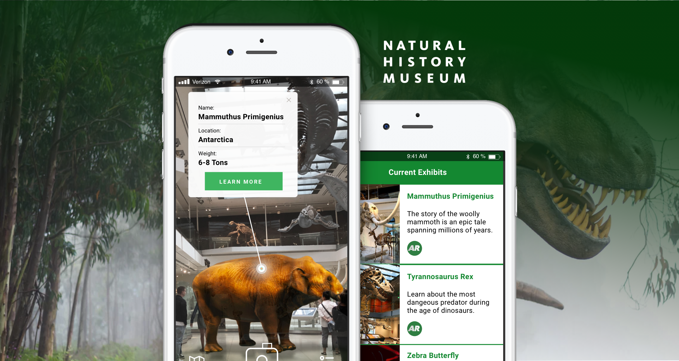
Based on our findings from the Competitive and Comparison Analysis, User Research, and Feature Prioritization Chart, we concluded that the app should center around the feature of Augmented Reality.
Design
To begin the design process we conducted a Design Studio where each member of the team created eight layout concepts. These quick and loose sketches were then considered as a team in order to make some initial decisions about the direction of the app’s design. After reviewing the sketches as a team, we then moved to the whiteboard to iterate the design and create the initial wire flow.
Usability Testing
We developed mid-fidelity mobile wireframes to conduct usability tests. Before starting the testing we showed the participants a mockup advertisement that visitors would see prior to entering the museum.
The reason for this was that we had learned from our user interviews that parents were skeptical about their kids phone usage and would have a need to feel secure that the museum app would be providing educational value by enhancing the museum experience, but not replacing real-life.
Mid-Fidelity Paper Prototype
With the visual context of the museum’s banner advertisements in the mind of the participants, we then conducted two mid-fidelity paper prototype tests.
Some of the key takeaways were:
Add interactive arrows pointing to the Augmented Reality exhibits
Add the ability to turn the Augmented Reality info boxes on and off.
Change the camera icon from a circle to a camera symbol
High Fidelity Prototype
Based on the observations and feedback that we got from our usability testing we were able to iterate and build out the high-fidelity wireframes which we then tested via a clickable prototype using the Marvel App:
The high-fi prototype produced further useful information to iterate on:
The information box and “Learn More” button on Augmented Reality camera were too small.
Thought that the arrow in the camera might be an interactive element.
All icons and signifiers were easily understood.
Lessons Learned
In the end, we were happy to have reached our project goal of providing an interactive mobile app to enhance the visitor experience at the Natural History Museum. Through the process, we were able to define the target customer’s needs through research and testing.
In hindsight, we would have benefited from the following:
Including another natural history museum in our C&C instead of Disneyland.
Conducting more Contextual inquiries, including kids.
Talking with people who work at the museum to better understand their perspective.
Next Steps and Recommendations
Going forward for the next phase of the product our recommendations were:
Add social sharing to increase visibility
Maintain app interest outside of the museum (trivia, virtual world)
Expand the AR function to sister museums
Try to do more research into the problem space
View All Projects or connect with me below!
thegregwilk@gmail.com
www.linkedin.com/in/greg-wilk