User research and experience design for early stage wearable technology startup, ExcessPWR.
ExcessPWR is a posture support shirt with electronic sensors, developed by Dr. Romina Ghassemi of Think Healthy LLC, to be a simple way for people to improve and strengthen their spine and overall physical well being.
Our team was tasked with providing a prototype for a mobile app that in conjunction with the product worn at work or while exercising, would allow users to easily track the health of their posture.
Team: Greg Wilk, Jackie Ansell, Evan Chris, Cathy Lee
My Role: User Experience Designer
Design Tools: Sketch, InVision
Management Tools: Trello, Slack
Timeframe: 3 weeks
Discovery
Upon reviewing the notes from our initial meeting with the client, we realized that there were two clearly separate MVPs that we could work toward within the 3-week time constraint of our project.
Option One
Redesign the current ExcessPWR website, featuring a smooth on-boarding process and initial risk assessment,
with the purpose of building the brand and audience.
Option Two
Create a prototype of a mobile app that would work in tandem with the ExcessPWR product with the purpose of acquiring additional funding from investors.
After getting clarification that our client wanted the mobile app prototype, we conducted a Competitive and Comparative Analysis with six businesses in the wearable tech space to understand what features the customer would expect to see.
Some key points of interest at this stage were that most of the apps seemed to focus on body metrics, personal statistics and coaching, verses what we had viewed as common health app heuristics such as Nutrition Tracking, Heart Rate & Sleep Monitoring.
User Research
We prepared User Interview questions to get a better understanding of people’s knowledge and experience with wearable technology, thoughts about back pain, and motivations around using health and wellness apps. A few examples questions were:
Do you have any experience using wearable technology?
Do you currently use any health-related apps?
Are you concerned about the health of your back?
We conducted a total of 16 interviews, the majority of which worked in an office, or were involved in physical fitness, including a former pro athlete and a fitness instructor. Along with the interview questions, we also showed the participants a video promotion for the product.

By far the most insightful takeaway from the interviews was that most of the participants said they could not envision themselves wearing the product at work because it would be extremely inconvenient and add an additional burden to an already stressful day.
Because of this realization, we reached out to our client to discuss pivoting the app toward the dedicated athlete that wants to take their game to the next level.
Our client agreed with the refocused target customer. With that in mind, we revised our Affinity Map.
Some key insights were:

People are motivated by seeing their progress..
People want to be shown what they should be focusing on.
User Persona
We utilized the common trends and insights collected from our affinity map such as: I want one on one coaching, I want to improve my performance, and I think about my future self, in order to construct our customer persona Melissa Chen.
Scenario
Melissa recently started playing tennis with some of her co-workers and has become obsessed with the game. She wants to enter a tournament and in preparation, she takes a lesson. While there, her instructor informs her that in order to take her game to the next level, she must improve her posture and body alignment.
Problem Statement
Mellisa feels inspired to advance her tennis game, and needs to improve her posture and alignment to have a stronger swing but faces difficulty tracking her progress with accuracy.
How Might We
How might we help Melissa measure her progress while correcting her posture to reach her full athletic potential?
Feature Prioritization
To get clarity as to what features needed to be a part of the MVP we created a MoSCoW chart. We concluded that in order for the initial phase of the app to be considered a success the following features must be included:
Based on our user research we considered the video feature to be a necessity. We later realized that although it would be a pivotal piece for the future vision of the app, it was unnecessary to discovering if the core value of the product was valid.
Additionally, we created an Insight to Feature Chart in order to connect the key insights from our affinity map with the core features for the ExcessPWR app.
User Flow
We iterated on the user flow via whiteboard until we came up with the final version pictured below. Our main focus was to provide an easy to understand navigation in which the user could choose how they wanted to interact with the product.
Design
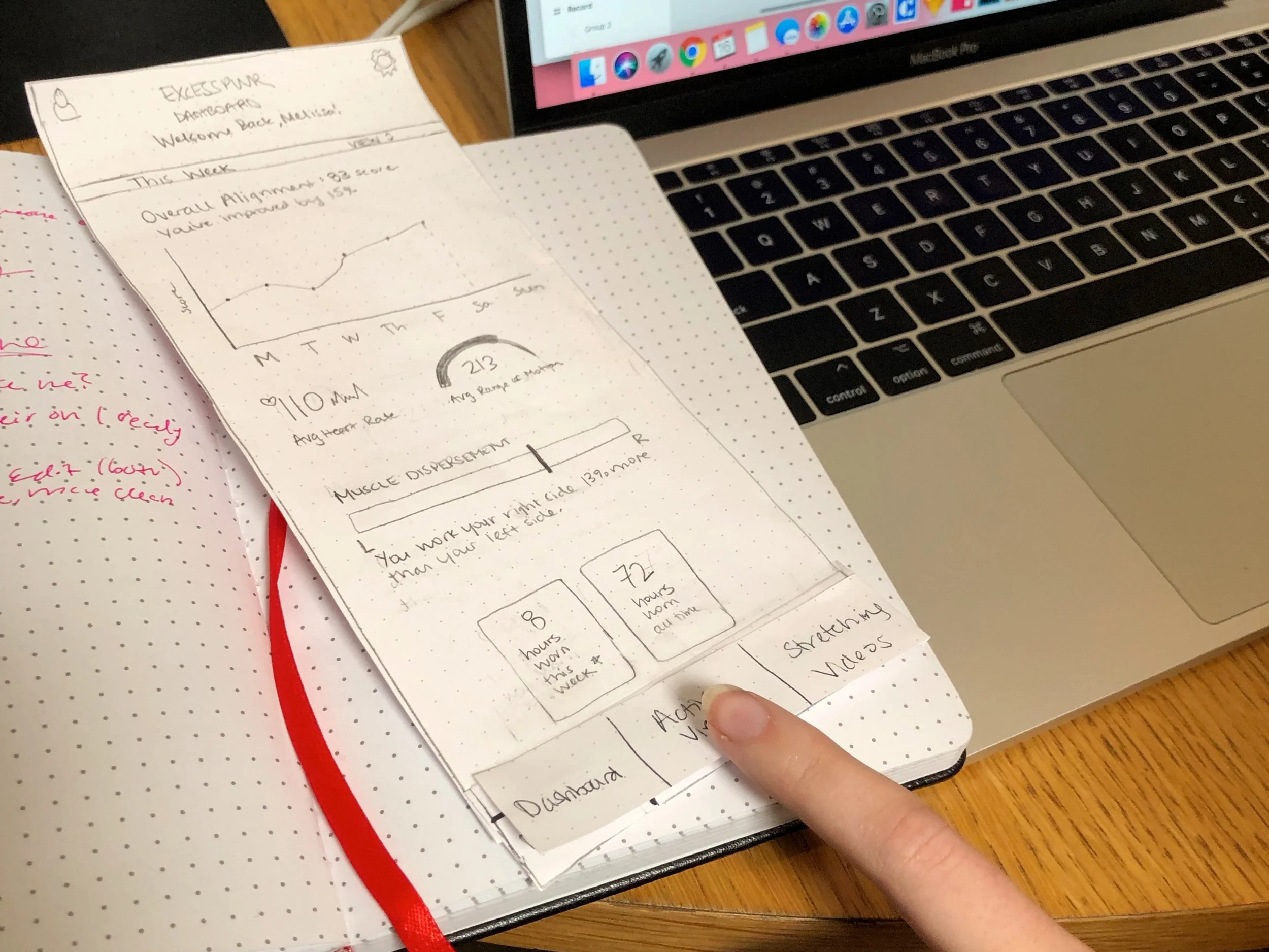
To begin the design process each member of the team created eight quick sketch concepts. We then considered them as a team in order to make some initial decisions about the direction of the app’s design.
Based on the various concept layouts from the team we were able to iterate toward the development of the initial low-fi paper prototype below.

Usability Testing
We conducted three usability tests with our paper prototype and came away with some valuable insights such as :
User was looking for a calibration notification with the product.
The challenges section was confusing.
Felt it was a “workout app”.
Disjointed transition to real-time view.
Based on feedback we got from our usability testing we were able to iterate and build out the medium-fidelity wireframes.
A/B Testing
From the usability testing, we noticed that the participants were somewhat confused regarding what the “LIVE” tab in the navigation was referring to.
We came up with some revised name variations and conducted an A/B test to see what would be the most easily understood by the user.
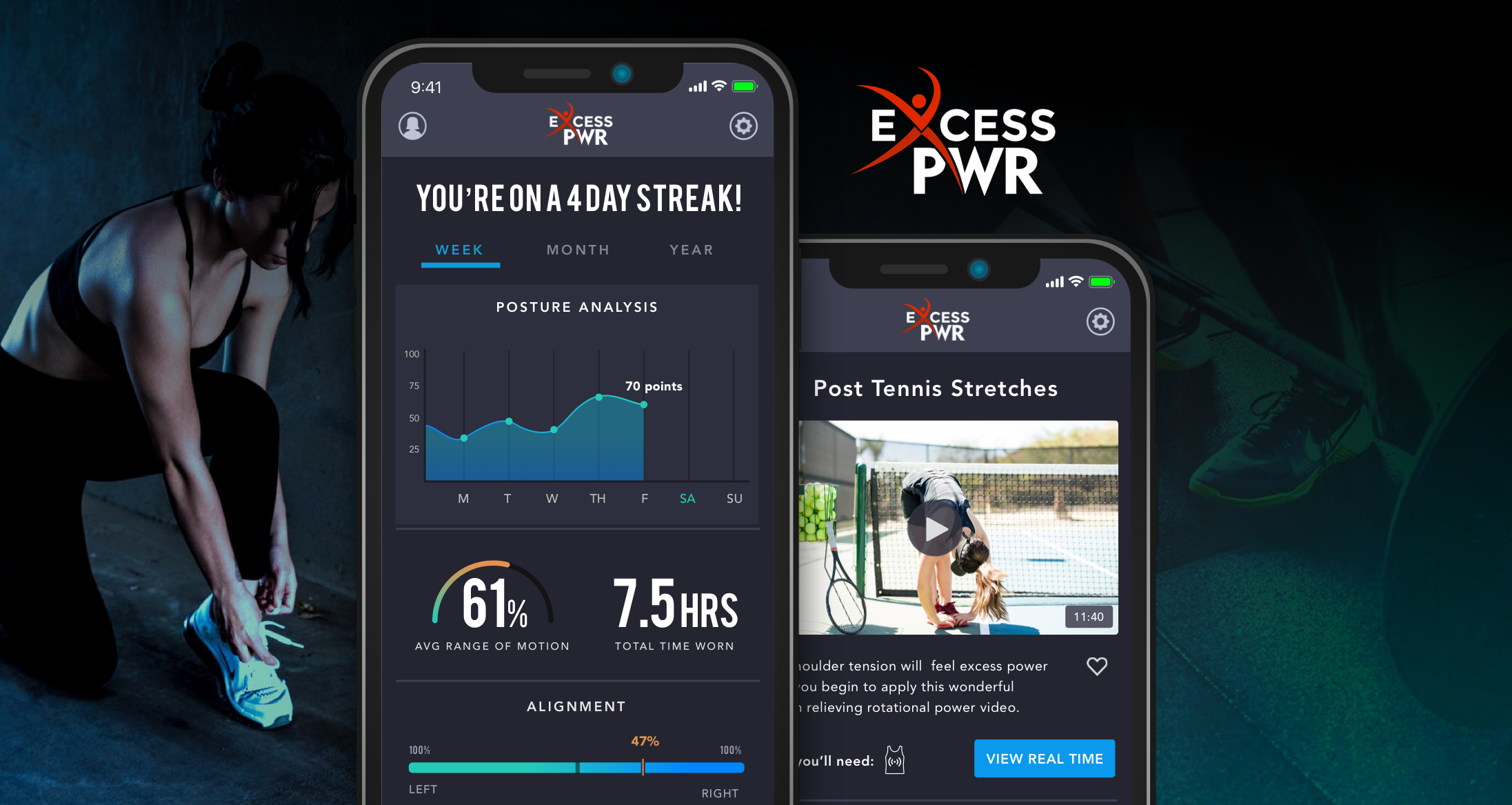
We ended up deciding to switch from “LIVE” to “REAL TIME”, which all of the A/B participants had no problem quickly understanding.
The term “Muscle Disbursement” was confusing.
Users weren’t sure what the vertical axis of the
“Posture Analysis” section was measuring.Users wondered, would the video player close if they switched to the “Real-Time” view?
Medium-Fidelity Prototype
We conducted another series of usability tests with the medium-fidelity prototype and gained further useful information to iterate on such as:

Survey Says...
Additionally, we conducted a survey via Google Forms to find out what most people felt the “Muscle Distribution” section of the dashboard should be called. It seemed ambiguous to us, so we wanted to utilize groupthink to come up with the proper terminology.
Results: “Alignment” received the most votes.
High Fidelity App
Utilizing the knowledge we gained from our C&C Analysis, Affinity Map and Feature Prioritization, We created the high fidelity design. A style guide was also developed at this point as a companion to the high fidelity design.
Lessons Learned
during our research we learned that people were very skeptical about wearing the product in a corporate environment. In hindsight, we would have benefited from spending more time with the client to get a better understanding of the product and its applications. Additionally, conducting contextual inquiries with the product would have gained us immense understanding that we were not able to attain without it.
View All Projects or connect with me below!
thegregwilk@gmail.com
www.linkedin.com/in/greg-wilk