Social impact Hackathon for Safe Parking LA, a non-profit homeless services.
Safe Parking LA is a non-profit organization dedicated to providing a secure and legal place for Los Angeles’s transitional homeless to park and sleep overnight. An important first step toward the ultimate goal of finding permanent housing.
My team was asked to help Safe Parking LA’s founder Emily Kantrum improve the way she receives and views the data from the applications that she receives.
Team: Greg Wilk, Desiree Dahlson, Natasha Lyons, Mike Feldberg & Mohammad Javad Mohseni Far
My Role: User Experience Designer
Design Tools: Sketch, InVision
Management Tools: Trello, Slack
Timeframe: 3 Days
Client Interview
The Hackathon began with all of the participating design and development teams meeting with the owner of Safe Park LA, Emily Kantrum. During this meeting we learned about the history of Safe Parking LA as well as the problems that she and her small staff face on a daily basis. From this initial client interview we were able to understand the complexity of the job she is trying to do.
Some of the many internal problems for Safe Parking LA were:
Ascertaining the accuracy of information
Synthesizing applicant data
Not enough employees to fill demand
Difficulty organizing the information gathered
Problems sorting information
Additional research needed for applicants
Not enough staff to handle the phone call demand
Acquiring additional parking lot locations
Figuring out what resources an applicant qualifies for
Some of the many problems for the transitional homeless
Need a safe place to park and sleep in their car overnight.
Need additional help and resources
Need to know where the nearest SPLA parking lot location is
Need to know how to qualify for SPLA services
Our Goal
Refine and simplify the SPLA on-boarding application form for the transitional homeless and improve the accuracy of the data received by Safe Parking LA as well as improve the sorting capabilities.
Defining the form
The majority of the time we initially spent was in deciphering the information that should be included in the form. We looked at this as the MVP. The constraint was not knowing the priority and value of the data being collected by Safe Parking LA.
Design Studio
We then conducted a design studio to white-board layouts for form concepts.Here we iterated on the Location feature and its value and how it should be presented. Was the clients' current location more important, or their preferred location more valuable? We decided that the preferred location would be more helpful.
Location Location Location
note here about the location issue
Defining the look
Pulling visual inspiration from the current safe parking la website. Clients would be more comfortable with cohesive branding. The color blue is soothing/calming , the color yellow is associated with street signs and other driving iconography.
Low Fidelity Wireframe
We wanted to first and foremost make sure that the redesigned form interface would be easily useful to the client, keeping in mind that they would be in frantic and fearful state of mind. We also wanted to provide some sense of visual inspiration to improve the client's mood and let them know that help was on the way.
Using the key insights from these interviews we created both a parent and a child Affinity Map to discover trends and define the core user values and needs.
Some key insights from the Affinity Maps were:
Children
Parents
Believe technology should cultivate creativity, but not replace real life.
Monitor their children’s phone usage to make sure they are using it responsibly.
Want to feel secure letting their child use technology.
Tend to get bored when they are looking at traditional art and exhibitions.
Have the most fun when moving around and interacting with things.
Want tmore opportunities to make their own choices.

Contextual Inquiry
In order to help define the user’s needs, we took a trip to the natural history museum. While there, we were able to get a better understanding of the features and limitations of the space, observe visitor and staff behaviors, and conduct a Contextual Inquiry with visitors.
Through this research we found that:
Children prefer interactive screens.
Children prefer to be physically engaged.
Parents have a a very difficult time getting their
children to be interested in still artifacts.
User Persona
Using the insights and common trends from our Affinity Map, as well as observations from the Contextual Inquiry, we were able to construct our customer personas; Dave and Lilly Miller.
“I want to teach my kids to live in the moment.”
“My favorite games are Fruit Ninja and Hello Kitty Cafe.”
Scenario
On a rainy day, Dave decides to take his daughter Lily to the museum. When he tries to show her the historical artifacts in the exhibit, she gets bored and asks to play games on his phone.
Problem Statement
Dave feels frustrated about Lily’s lack of interest in the museum exhibits and needs to keep her engaged, but the exhibits lack interactive elements.
How Might We
How might we leverage technology to help Dave teach his daughter about history in a fun and engaging way?
Feature Prioritization
To understand which features to prioritize for the MVP of the app we created a Feature Prioritization chart.
Based on our findings from the Competitive and Comparison Analysis, User Research, and Feature Prioritization Chart, we concluded that the app should center around the feature of Augmented Reality.
Design
To begin the design process we conducted a Design Studio where each member of the team created eight layout concepts. These quick and loose sketches were then considered as a team in order to make some initial decisions about the direction of the app’s design. After reviewing the sketches as a team, we then moved to the whiteboard to iterate the design and create the initial wire flow.
Usability Testing
We developed mid-fidelity mobile wireframes to conduct usability tests. Before starting the testing we showed the participants a mockup advertisement that visitors would see prior to entering the museum.
The reason for this was that we had learned from our user interviews that parents were skeptical about their kids phone usage and would have a need to feel secure that the museum app would be providing educational value by enhancing the museum experience, but not replacing real-life.
Mid-Fidelity Paper Prototype
With the visual context of the museum’s banner advertisements in the mind of the participants, we then conducted two mid-fidelity paper prototype tests.
Some of the key takeaways were:
Add interactive arrows pointing to the Augmented Reality exhibits
Add the ability to turn the Augmented Reality info boxes on and off.
Change the camera icon from a circle to a camera symbol
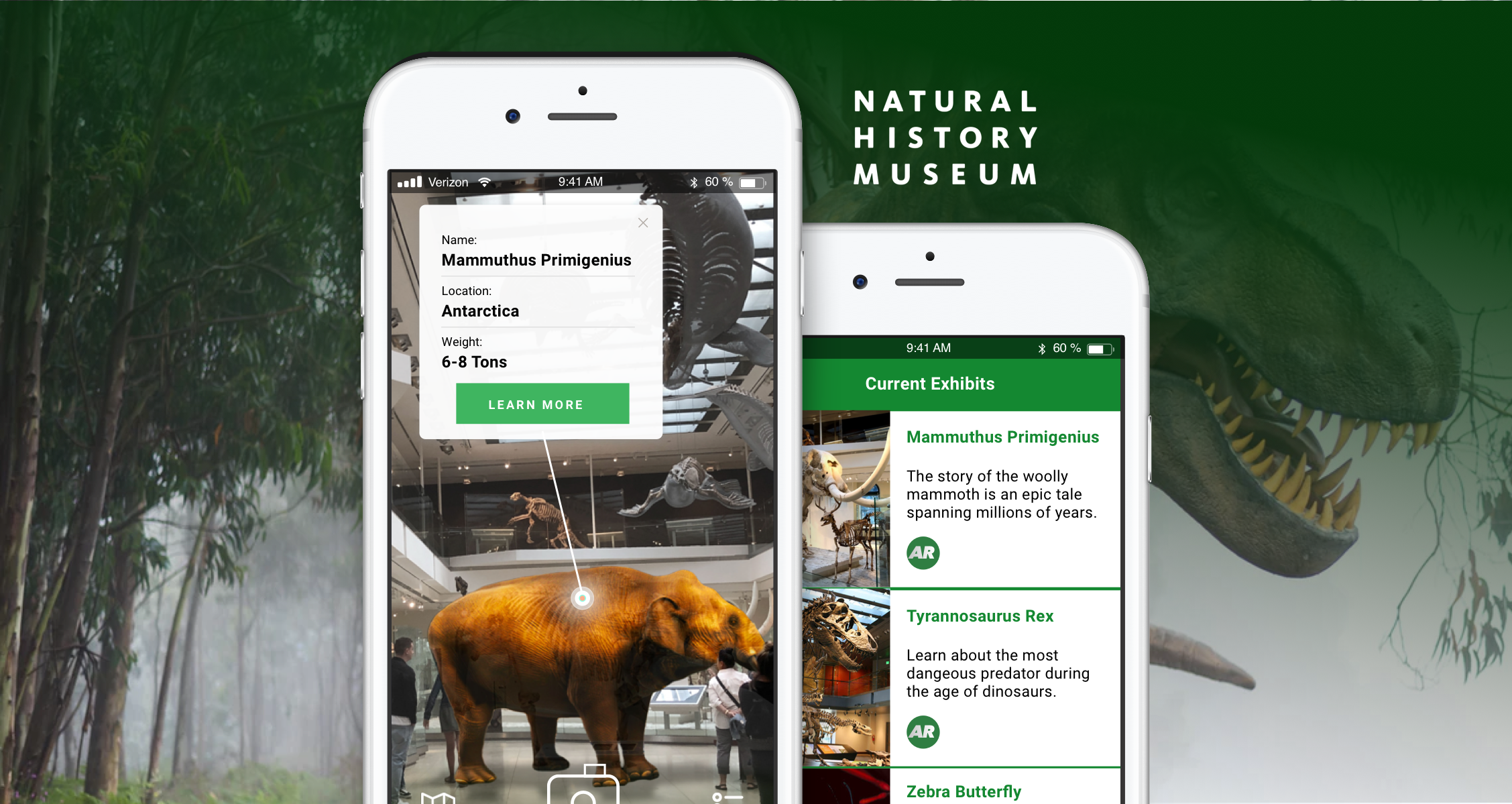
High Fidelity Prototype
Based on the observations and feedback that we got from our usability testing we were able to iterate and build out the high-fidelity wireframes which we then tested via a clickable prototype using the Marvel App:
The high-fi prototype produced further useful information to iterate on:
The information box and “Learn More” button on Augmented Reality camera were too small.
Thought that the arrow in the camera might be an interactive element.
All icons and signifiers were easily understood.
Lessons Learned
In the end, we were happy to have reached our project goal of providing an interactive mobile app to enhance the visitor experience at the Natural History Museum. Through the process, we were able to define the target customer’s needs through research and testing.
In hindsight, we would have benefited from the following:
Including another natural history museum in our C&C instead of Disneyland.
Conducting more Contextual inquiries, including kids.
Talking with people who work at the museum to better understand their perspective.
Next Steps and Recommendations
Going forward for the next phase of the product our recommendations were:
Add social sharing to increase visibility
Maintain app interest outside of the museum (trivia, virtual world)
Expand the AR function to sister museums
Try to do more research into the problem space
View All Projects or connect with me below!
thegregwilk@gmail.com
www.linkedin.com/in/greg-wilk